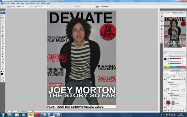
Here are screenshots of each stage in which I produced my work.
Stage 1
I produced my magazine front cover in photoshop starting with a blank page. i have used photoshop before in my pre-lim task so found it easy and quite quick to produce my front cover.

Stage 2
Firstly I added my background image which was a picture of Joey Morton. I adjusted the image so it filled the whole background. I then started to add all of my text so it would fit around the image.

Stage 3
Next I added the title with I added on a seperate background of the picture. I rubbed part of the title out with the rubbing tool so it could look like the title was behind the artists head. Alot of well known magazines use this technique because they are such well known magazines, even if part of the title of the magazine is covered, people will still recognise it from the font and colour of the text. Also following the codes and conventions of a music magazine I my my title to fill the whole length of the page. This makes it stand out and grabs the readers attention.

Stage 4
Next I added some of the cover stories which are featured in my magazine to the right and left hand side of the front cover. I followed my colour scheme and had the text in black and red. This helped to break the etxt up and make it more easier and interesting for the readers to look at. I rearranged the size of the text on each coverline so that the names of artists would stand out to catch the attention of my audience.

Stage 5
I then added the main cover story of Joey Morton onto my front cover. This was spread accross the whole length of my page and in white to stand out from the rest of the stories. I also used the buzz word 'exclusive' to attract readers so that they think they will only read this exclusive story in my magazine and no where else.
 #
#Stage 6
Then I added a stapline accross the bottom of my page with a white back ground and the buzz word 'plus' to make it stand out and be eye catching to my readers. I also added a cover line which I positioned ontop of a red circle to make it stand out. I had each word in a different layer so I could adjust them to fit into the circle and fill the space.I made the word 'blowouts' bigger than the rest of the story so that it would attract the readers.
Stage 7
Lastly I added the bar code, date, issue, price, website and tagline. For my tagline, I followed the codes and conventions and placed it underneath the title as that is where it is normally position. I filled the website into the D of Deviate so that it would stand out. I placed the bar code, date, issue and price in the bottom left corner so that people could still identify them but they wouldn't take away from the design of the front cover.

Here is my final draft of my magazine front cover. I was really happy with the end product and think that it really reflects the genre and feel of magazine I originally wanted.

No comments:
Post a Comment