Thursday 15 December 2011

PHOTOGRAPHS FOR DOUBLE PAGE SPREAD

Here are all of the picture which I took in preparation for my double page spread. I only used two pictures on my double page spread but took a variation of pictures in different environments showing different sides to the band so I definitely had a right picture to fit with the interview.

The following pictures are all of the pictures I took of the band whilst practising. I took pictures from different angles, individually and together. I really liked certain pictures from their practise because they really show off their type of music and how passionate they are about their music. I didn't use any of these pictures because the ones I chose, I thought where more suited to the interview. 


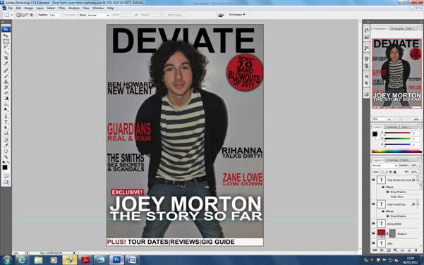
This picture was used on my contents page because I thought it really reflected the band and their music well. I like this picture because the background looks a bit mysterious but quiet light hearted as the band are. 


This picture was also used on my double page spread as an extra image. This shows their fun side whilst they are at band practise. In the interview, their are a lot of serious topics with well though out answers, and then there are times in the interview where they are really relaxed and joking about. I wanted my audience to see this side of them so therefore chose this picture. The interview represents my magazine as well and although in my magazine I will touch on some serious topics in interview ect. I want people to enjoy reading my magazine and feel relaxed whilst reading it. I think this is a great picture to portray that idea within my magazine.

Tuesday 13 December 2011

CONTENTS PAGE PRODUCTION

Here are the different stages in which I produced my contents page. I produced my contents page in Quark express. I have experience with using this software from when I produced my pre-lim task of a school magazine contents page. I found it easy to align all of my different sections up and import pictures and text. I think it was hard making sure every detail was precise like the different fonts and font sizes but I managed to complete this.


Stage 1
I started with a blank page in quark express. It is useful in Quark express because it has guidelines and you can import your text so that it sits in the guide lines. This is also good ecause the codes and conventions of a music magazine contents page is that it is normally set up in 2-3 columns.


Stage 2
I next added my contents page title. I used the same font as on my front cover. I made it stretch accross the full length of the page to match my front cover. I had a black background so that it would stand out.

Stage 3
Next I added all of my text. I arranged my text so that it would be in two sections, but in three columns. I placed all of my feature articles on the right hand side column and my reguklar articles on the left two columns underneath where my pictures will go.  I put each page number and articles title in bold so that they would stand out to the reader. I then had a small description of each article underneath the title to intise the reader.  


Stage 4
Next I added my contents page pictures. I chose my picture of up and coming artists and made it the biggest picture on the page. This is because it was a portrate picture so it fitted onto the page well. Then along side this a added a picture of Lykke Li, Danny O'Donoghue and Joey Morton. I chose these pictures because they are my main stories on my fron cover and the live picture of Danny O'Dooghue because I think it will intise the readers.  On the codes and conventions of a music magazine contents page, the main article and picture on the front cover, useually has a partnering picture on the contents page. I also put a small border around each picture to make them stand out and also to seperate them.

Stage 5
This I added the tag line under my contents page title. I made this in italic and in red so it would stand out. I also added the my section dividers which I made in photoshop.  I made each title in a separate document on photoshop and then saved then at JPEG's. I then imported these into quark in a picture box and arranged them between my text. It is useful in quark because you can put a picture between the text and it will fit around the picture. I made four different titles; feature, we love, news and live. I put the stories under neath each title it best suited.

Stage 6
Lastly I added article page numbers to my images and then added my page number, and date. I also added an article title to the image which goes with the 'up and coming artist' article. I used a seperate text box so that I could position it where I liked. I put my article page number in a shadowed effect so that they would stand out to that reader and that they could go straight to that article. I placed my date at the top right hand corner ad this is a code of music magazine contents page.

Thursday 8 December 2011

PHOTOGRAPHS FOR CONTENTS PAGE

Here are all of the pictures I took for my contents page. I took lots of different pcitures with the people in them doing different poses so that I had a variety to chose from.


I cropped this picture of Joey Morton to be featured on my contents page because I thought it could show a more innocent side of him.

This is a picture I took from a live concert of Danny O'Donohgue which I chose to put on my contents page.

This picture is a picture of an up and coming artist. I really like the way a guitar it used in this picture because it relates well to the indie genre of my music because there is a lot of acoustic indie music around that will also feature in my magazine.

It was between this picture and the picture below out of all of the pictures I took of Lykke Li for my contents page. I didnt chose this one because I dont think it is a serious as I would like it have been for my contents page.

I used this picture on my contents page. Looking at the codes and conventions of a music magazine, I know that there is usually a picture which goes with the picture from the front cover on the contents page. This is my connecting picture tot he story of Lykke Li on the front cover.

FRONT COVER PRODUCTION

Here are screenshots of each stage in which I produced my work.


Stage 1 
I produced my magazine front cover in photoshop starting with a blank page. i have used photoshop before in my pre-lim task so found it easy and quite quick to produce my front cover.


Stage 2
Firstly I added my background image which was a picture of Joey Morton. I adjusted the image so it filled the whole background. I then started to add all of my text so it would fit around the image.


Stage 3
Next I added the title with I added on a seperate background of the picture. I rubbed part of the title out with the rubbing tool so it could look like the title was behind the artists head. Alot of well known magazines use this technique because they are such well known magazines, even if part of the title of the magazine is covered, people will still recognise it from the font and colour of the text. Also following the codes and conventions of a music magazine I my my title to fill the whole length of the page. This makes it stand out and grabs the readers attention.


Stage 4
Next I added some of the cover stories which are featured in my magazine to the right and left hand side of the front cover. I followed my colour scheme and had the text in black and red. This helped to break the etxt up and make it more easier and interesting for the readers to look at. I rearranged the size of the text on each coverline so that the names of artists would stand out to catch the attention of my audience.


Stage 5
I then added the main cover story of Joey Morton onto my front cover. This was spread accross the whole length of my page and in white to stand out from the rest of the stories. I also used the buzz word 'exclusive' to attract readers so that they think they will only read this exclusive story in my magazine and no where else.

#


Stage 6
Then I added a stapline accross the bottom of my page with a white back ground and the buzz word 'plus' to make it stand out and be eye catching to my readers. I also added a cover line which I positioned ontop of a red circle to make it stand out. I had each word in a different layer so I could adjust them to fit into the circle and fill the space.I made the word 'blowouts' bigger than the rest of the story so that it would attract the readers.


Stage 7
Lastly I added the bar code, date, issue, price, website and tagline. For my tagline, I followed the codes and conventions and placed it underneath the title as that is where it is normally position. I filled the website into the D of Deviate so that it would stand out. I placed the bar code, date, issue and price in the bottom left corner so that people could still identify them but they wouldn't take away from the design of the front cover.


Here is my final draft of my magazine front cover. I was really happy with the end product and think that it really reflects the genre and feel of magazine I originally wanted.


PHOTOGRAPHS FOR FRONT COVER

Here are the different photographs I took for my front cover. I chose to have an indie styled boy on my front cover. I experimented with different poses and styling. There were a lot of different quirky poses that I think looked really cool and matched to my indie genre.
I liked the use of the Guitar in these next few pictures but I dont think they were the right feel for my magazine. I knew my magazine needed a more laidback and cool approach to it.  


I didn't really like this picture and the pose in this picture because I thought it seemed more adequate for a pop magazine than an indie magazine.


I liked these next two pictures because I think they really match the laid back feel for my magazine but I didn't think they were eye-catching enough for my front cover.


I experimented with different camera angles for my front cover, for example high and low angles like I have demonstrated in the next few pictures.


I really liked this picture but needed to have the person on my front cover looking directly into the camera so I didn't use this picture.


This is the picture I used in my front cover. I chose this picture because I love the way Joey looks mid action but still looks really look and laidback. He really fits the indie genre, is looking directly into the camera, and I was really happy with this picture that I got.